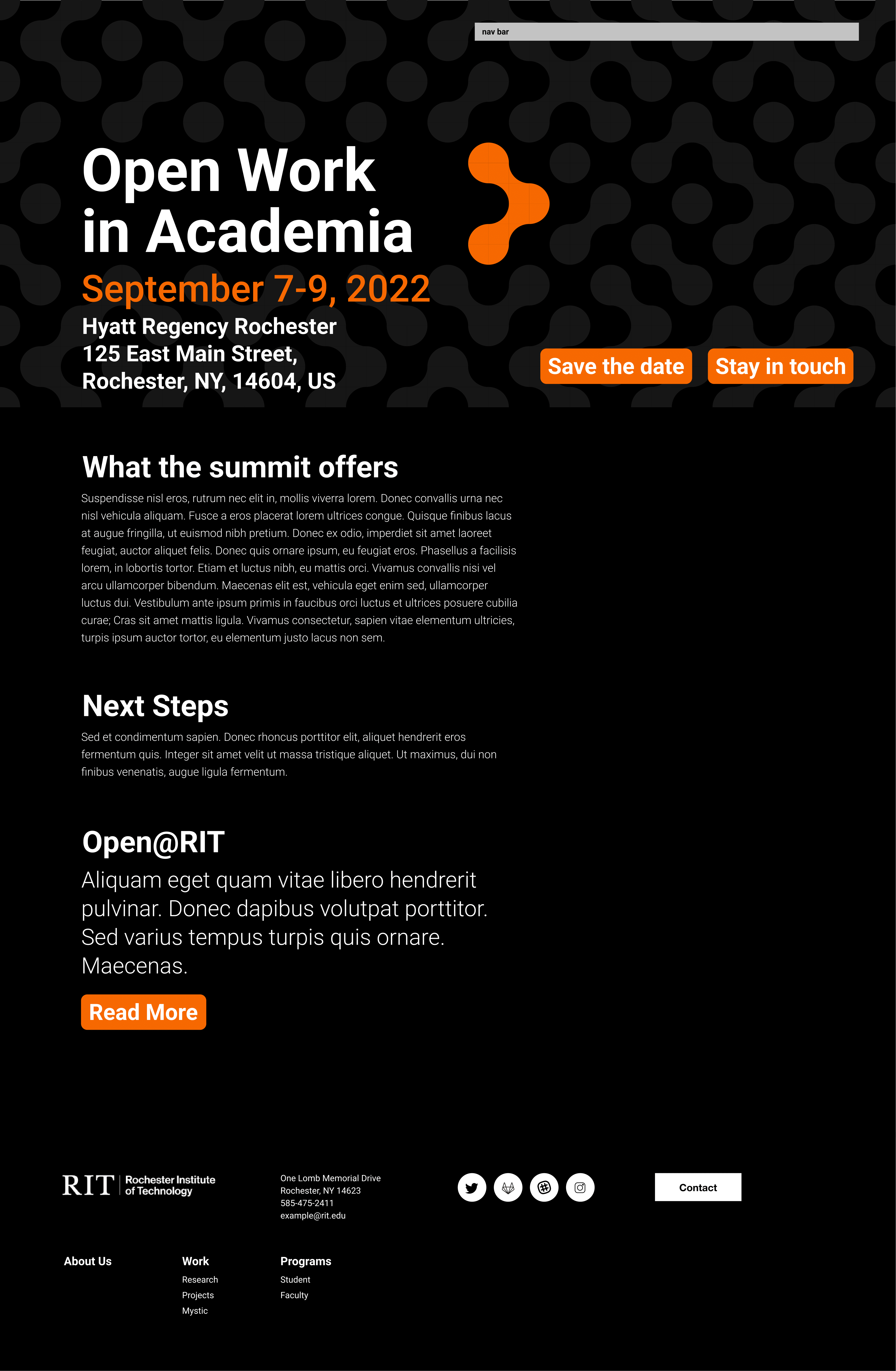

My team and I sought to distance this site visually from several cues of the visual language of the institution. Given that the program was neither sponsored, nor hosted through the institution, we felt it was appropriate to give the summit a different feel to the sites developed for the department and our fellows.
The site was designed to conform to WCAG 2.0 guidelines for visual and text content. It was to be legible and navigable by screen reader or other user agents, laid out exclusively in text without the use of icons which would need definition, and presented in high contrast with very little reliance on color. What things that existed that were called out by color were also called out visually either in contrast, change in font, or header.
Unfortunately, the decision to go beyond the graphic design guidelines of our parent institution (even to improve accessibility) proved to be a mistake, but an educational one. The project was approved and celebrated by our entire department, but ran aground on the shores of bureaucracy. The university's department of branding and web development informed us that we no longer had the privilege to produce the site ourselves at all, and the visual work was scrapped. Sometimes even when the whole department is on board, other, higher offices, have the final say.
What remained was the navigation and site organization, albeit built within the framework set out and developed by RIT.