From Newsletter to New Community

Reimagining the learning experience for test automation professionals.
UX/UI Designer, UX Researcher
Project Overview
In 2018, Sauce Labs acquired the Elemental Selenium tip site, which hosts a collection of hacks and tips for browser automation using their product, Selenium. Included in a package deal with that site is a mailing list of over 20,000 subscribers. It sat unused until Sauce Labs wanted to build a community-fed tip site that helps software testers keep up to date with the technologies that they use in their daily work. To do so, we would revitalize the existing site and boost engagement while open sourcing it, in the hopes of developing a community of contributors to keep the site running long term.
The Team
My team served as the accelerator working group, getting everything set up to give the project enough inertia that it had the best chance of becoming self-sustaining once it was launched into the open. To that end, the team was two developers, two content editors, and a designer (myself). We also had the support of several members of the Selenium Community and reported directly to a senior designer at Sauce Labs to check our work and ensure we were moving in the right direction.
Elemental Selenium struggled to engage users due to stagnated content. Based on the site's current structuring and content focus, we assumed that that the most represented demographic would be juniors. We hypothesized that subscribers would be looking to understand the best practices of a product that they were either new to, or were unsupported with at their company. These assumptions were put to the test with user research.
Problem Space & Assumptions

- Subscribers were predominantly juniors
- Subscribers lack support from their company
- Subscribers are looking to understand the best practices of a product that they are inexperienced with

Our research plan consisted of a survey followed by qualitative user interviews. From our assumptions we drafted research criteria and turned them into survey questions. That completed, we sent out our first survey to the existing mailing list and within 45 minutes we had received enough global responses that we had to close it down again. The mailing list wasn’t as dead as we thought.

The Key Findings:
- People look first for credible resources when solving problems in code, usually opening with Google.
- Several of our responders were not comfortable contributing in environments that are viewed as rude or unsafe (like Stack Overflow).
- 52% of responders ranked themselves somewhat likely to contribute to a community, with 18% saying that they would be likely to contribute to webinars, live broadcasts, and forum posts.
- There were requests for more content for beginners, smaller information chunks, and options to try out code snippets.
Initial Research

Survey invitation sent to 20,000 person mailing list
Results demonstrated that:
- Our audience was not juniors
- Diverse content keeps people coming back
- They want more!

Based on our feedback we began initial explorations as a team. Our research had demonstrated that while members of the community were moved to contribute, they just couldn’t figure out how. It was our job to make that easy for them. 

I conducted a card sort exercise to reorganize existing content in order to facilitate an improved navigation and filtering experience. The net result was content that was more neatly organized and better tagged for filter and search functions.

From our moodboarding I defined a desired feeling for the site, the goal was to feel inviting and familiar by using softer shapes and saturated colors.

In order to progress our ideation I facilitated a Wild 8s exercise with the team. We wanted to quickly ideate on the information hierarchy and think about how we could bring existing content forward in a new and clearer way which would emphasize our new CTAs.
Ideation

- Explorations commenced based on user feedback
- Card sort to organize existing content
- Created a moodboard for the project
- Multiple iterations from wireframing through visual design

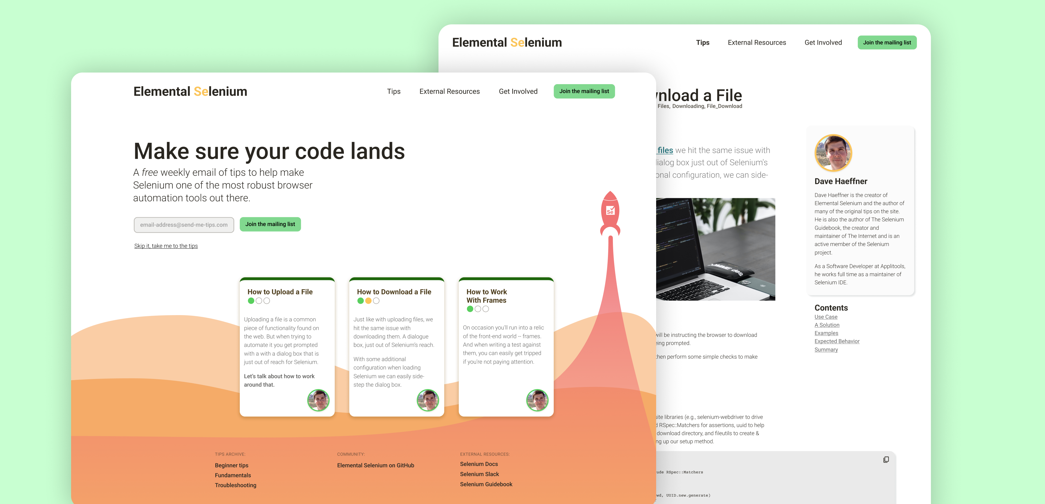
Elemental Selenium should be welcoming, compassionate, inclusive, and non-judgemental. It should feel familiar, clean, and warm.

Once we were satisfied with the new information architecture and a refreshed visual design, I developed several prototypes and conducted a series of usability studies with select participants.
Solutions

Build a new visual identity that inspires confidence
Update & test existing content
Open source and promote the project to invite new content

Testing Criteria

- Users should see value in the updated content for Selenium Automation
- Users will easily search and filter the information to find what they need to get the job done.
- Users will understand how to contribute to the newly established community, and how to join the mailing list.

Findings

- Users did appreciate the new search and filtering patterns
- Users struggled with understanding difficulty indicators for the content
- In a departure from the existing flow, users preferred to keep the newsletter subscription language-agnostic as they often changed the tech stack they work with.

Based on the user feedback I continued to make iterative updates to our prototype. I also aligned with my development counterpart to provide necessary updates as our development process was already underway due to time constraints.

For the conclusion of the project I delivered an interactive 1:1 Figma prototype for development, all visual assets required for said development, and documentation to support further design systems. I often speak publicly about the need for good design documentation, and since our team would be leaving this project as it was taking flight, it was even more necessary.
Deliverables

- Design system foundations
- Documentation to support further design contributions
- Visible assets for the website