Designing for Growth

UI/UX Design, UX Research
Problem
Open@RIT had an issue. Their existing site, located within the Rochester Institute of Technology’s infrastructure, was limiting their ability to provide the transparency and resources they wanted.

In order to further grow and expand as a department within the university, they needed a change.
Solution
Develop a new UX Architecture based on user research and use that to design a 1:1 prototype that fit within the RIT Branding Guidelines to be handed off to our full stack developer for implementation.
My Role:
UI/UX Design, UX Research
Tools Used
Figma, Adobe Illustrator, Adobe InDesign, Zoom, Google Hangouts, Collabora Office, Miro
Mockup of a macbook pro, showing on screen the new Open@RIT website design.
An animated gif of the original infinity scrolling web page.

Challenges

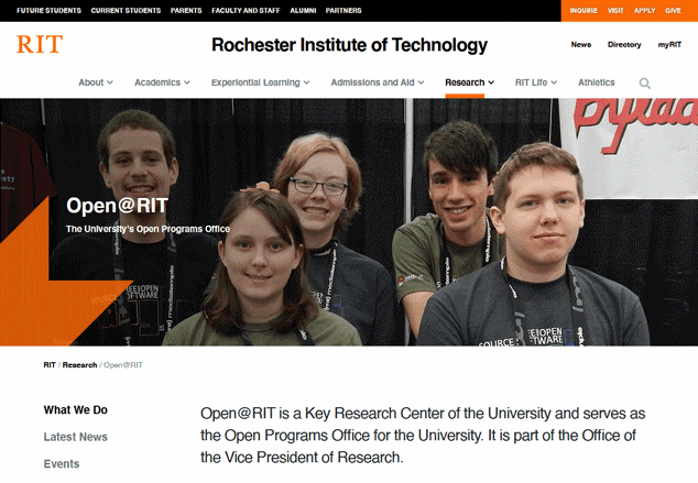
The original site, hosted through the University, was a single page with the majority of its content in one long scroll. Links to other content were exclusively embedded within text blocks, making finding information you were skimming for difficult if not downright uncomfortable.
Said information was also not grouped by relevant stakeholder, requiring students to comb through information for potential fellows, and vice versa. In short:

Difficult to navigate
Lacks space for new content
Not organized with stakeholders in mind

Two portraits used to designate personas. On the right is a young African American woman with black hair, a green shirt, and glasses, she is staring into the camera. On the right is a Caucasian man standing at the front of a classroom, he is bald with wire frame glasses, a grey blazer, and a yellow t-shirt.

Stakeholder Research

To ensure that the project would meet the needs of our most important stakeholders, I conducted interviews with several members of our community to synthesize personas to design to.

Worryingly, my findings suggested that none of our community had discovered us through our web presence, and perceived the site as a less-than-relevant information repository.

A document pertaining to the professor persona. Text reads: Robert O. Research professor at RIT trying to open previously closed research. About five years ago he completed a large project which was, at the time, closed. He has since gained full intellectual property over said research and wants to release it on an open source license. This is his very first time working in the open world. Goals: Release his work in a way people will benefit from. Understand the steps of the process so he can do further open work. To use the site to provide information to his peers to help them understand the necessity of open work. Needs: Help understanding open licenses. Understanding the current state of the Open World. Frustrations: Site is hard to navigate to look for changes. Communication to site directors hard to find.
A quote by persona 1, the professor. "I just use the site as a text repository, I can't say I've ever used it to find out recent news about the center."
Persona 2. Sophia A. Text reads: 
"Sophia A. Sophia chose RIT so she could engage in an already established FOSS (Free & Open Source Software) community during her study. She wants to pursue work post-graduation in the Open World and is using Open@RIT to jump start that career. She uses blurbs from the site as ready-written copy to insert into write ups for research applications & honors program documentation. Goals: Connect with open source communities on campus. Connect with people working in open source outside of RIT. Learn about career paths available in the open sector. 
Needs: to know about open source projects on campus. To connect with professors affiliated with Open@RIT. Information about open source curriculum. Information about contributing to Ppen@RIT. Frustrations: Lack of information present on the current site. Lack of networking opportunities present for members. Quote by Persona 2, Sophia A. Quote reads: "I don't navigate the site, I just know what links to use to share the right page with my friends or honors advisors. The website feels just like it was made for the people maintaining it."
a screenshot of figma, it is chaotic and spread out, but features numerous pages grouped by content and proposed user flow.

UX Architecting

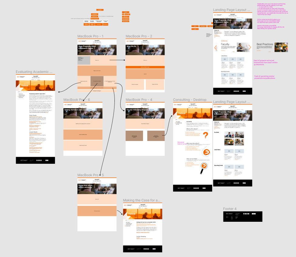
With the stakeholder needs identified, I took time to sort existing and planned content into three categories:

Student needs
Faculty needs
Department required information

A rough form began to take shape within the guidelines of RIT's graphic standards. My goal during this phase was a website that balanced the needs of our Student & Faculty stakeholders with the department's need to provide information to parties outside of the university's community. For example, potential funders, donors, or educators looking to establish similar departments at their university.

A much more ordered screenshot of figma, this time showing numerous prototyped pages all organized in rows and columns for hand off to developers. The number of pages is 16

Prototyping & Handoff

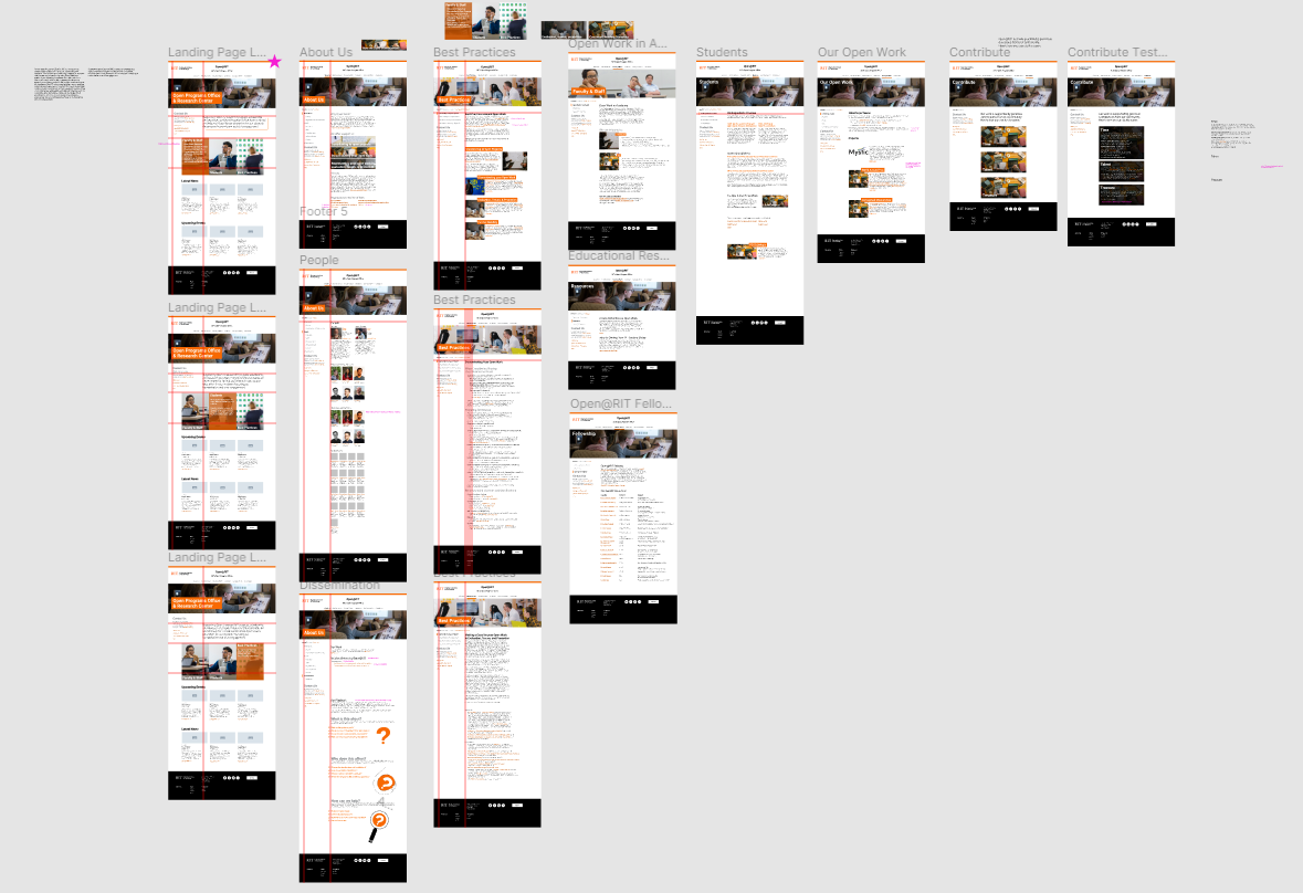
I made a lot of use of Figma's collaborative platform during this process, as it required soliciting feedback not only from our developer team and stakeholders, but our director, assistant director, and advisory board. It also allowed a select few of the original interviewees to provide their feedback as well, clarifying some of their original asks during the prototype phase.

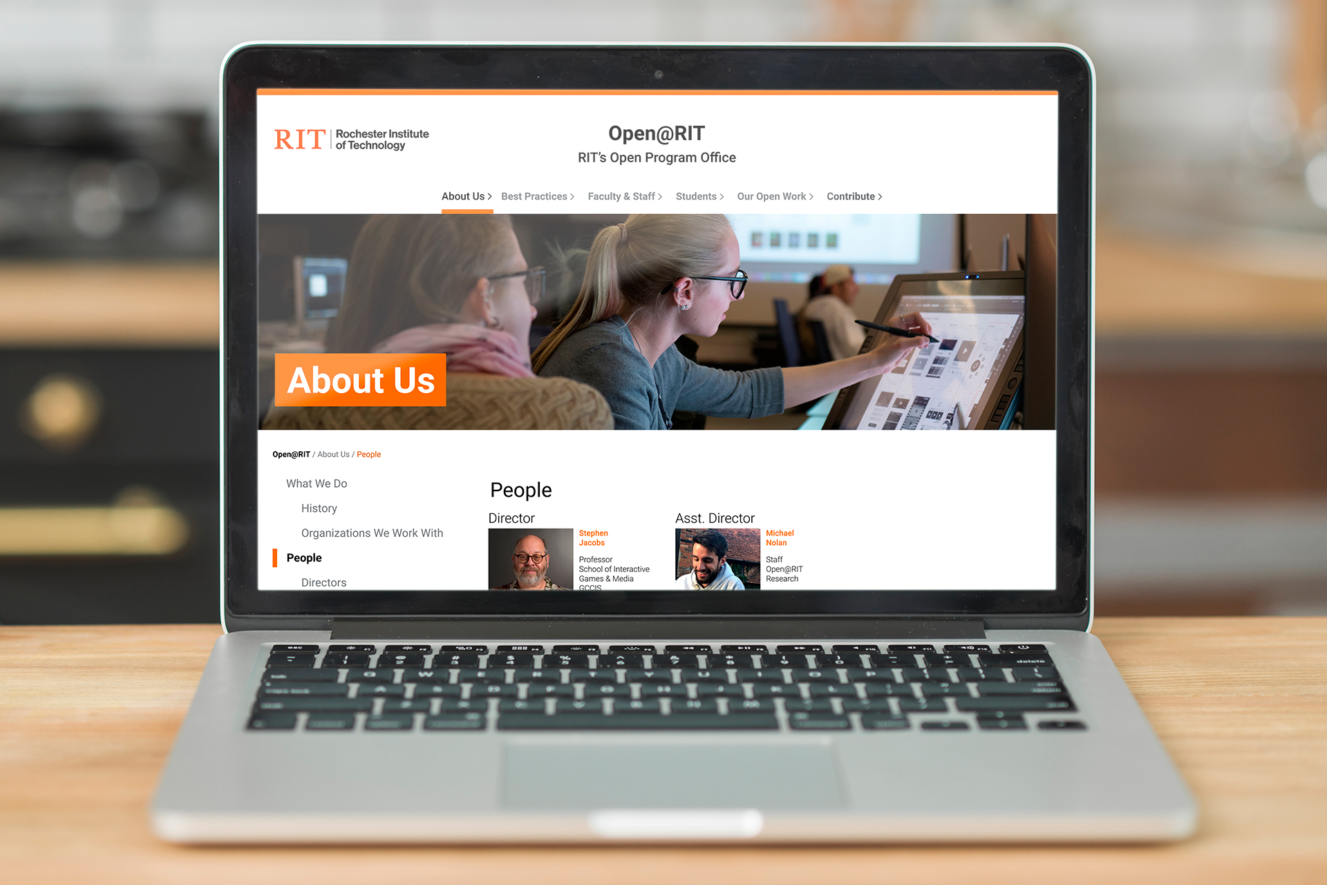
When the department was satisfied, the project was handed off to the developer to be published at openr.it

Next steps

With the site online, work is still ongoing. As we entered into a new phase with Open@RIT, I continued to listen to our community members to ensure the design is effective. Criteria includes number of interactions required to get to their most common tasks, ability to understand copy, difficulty in finding or following updated content, and other site specific requests.